Educational
The three types of 3D rendering for builder marketing are landscape, portrait, and square. Learn which format to use for websites, proposals, and Instagram.

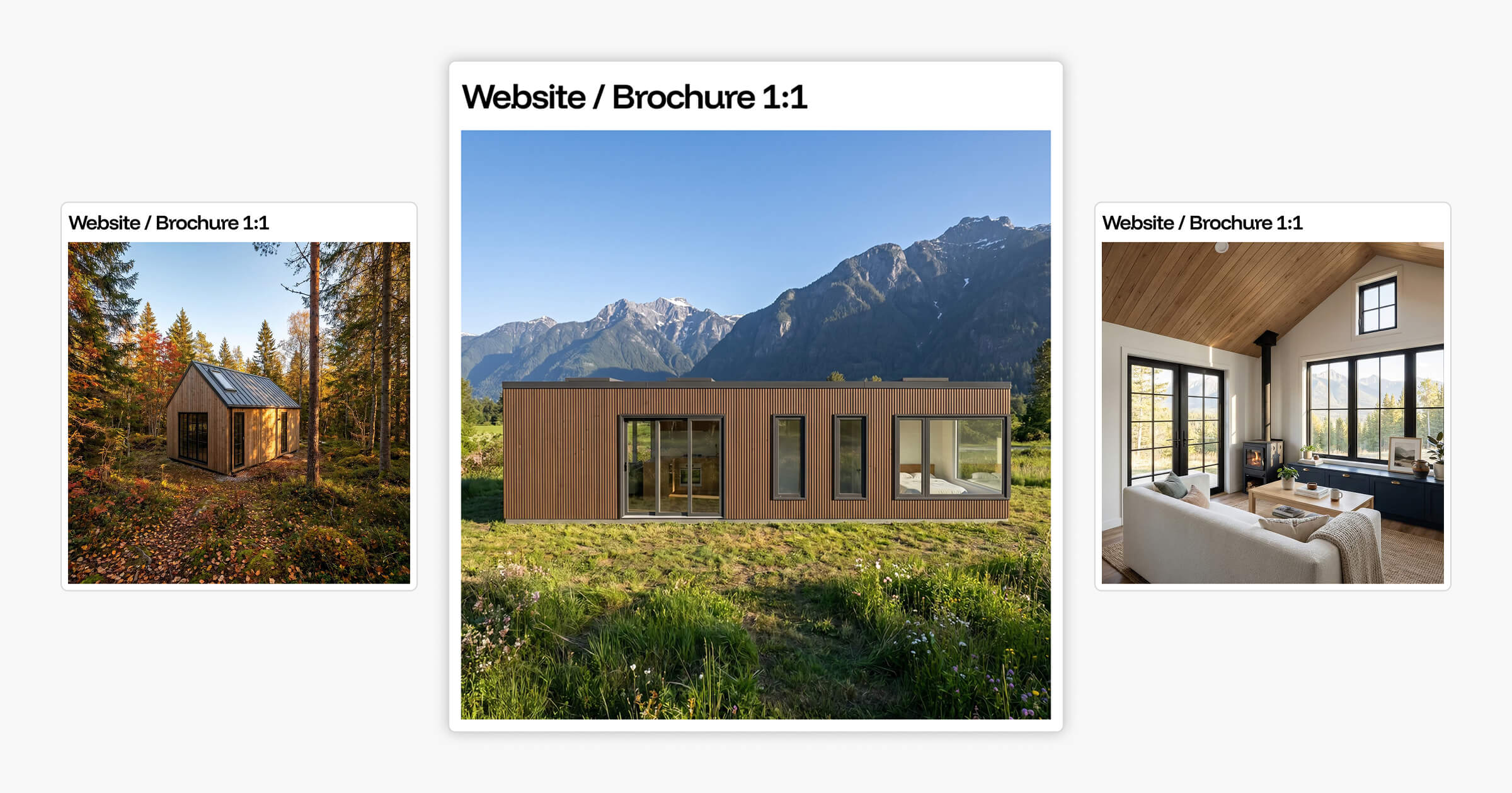
The types of 3D rendering used in home builder marketing fall into three format categories: landscape, portrait, and square. Each one's built for a different output: website hero sections, Instagram posts, proposal covers, and social stories. Choosing the wrong format reduces the impact of an otherwise strong visual.
Most builders generate one render and use it everywhere. The result is images that crop awkwardly on mobile, feel undersized in a feed, or leave empty space on a proposal cover. The render itself may be well-executed. The format decision is what undercuts it.
This article breaks down each type of 3D rendering format, where each performs best, and how the right render settings match the format to a specific audience and context. By the end, you'll know exactly which format to choose for any marketing or presentation use case your business runs.
Key Takeaways
What Are the Types of 3D Rendering?
The types of 3D rendering most relevant to home builder marketing fall into three format categories defined by aspect ratio: landscape, portrait, and square.
Landscape renders are wider than they are tall. The two most commonly used landscape ratios are 16:9 (the standard widescreen format matching most monitor displays and website banner areas) and 5:4 (a slightly squarer ratio suited to printed layouts, proposal documents, and presentation slides).
Portrait renders are taller than they are wide. The standard portrait ratios for builder marketing are 4:5 (optimised for Instagram feed posts, and 25% taller than a 1:1 square image in the same display width) and 9:16 (the full-screen vertical format used for Instagram Stories, Reels, TikTok, and Pinterest Idea Pins).
Square renders use a 1:1 ratio. They're neutral in orientation, fit consistently across a range of placements, and suit grid-based gallery layouts where consistent sizing matters.
Beyond the aspect ratio, the environmental settings applied to a render represent another layer of the format decision (often more impactful than the ratio alone). The same exterior design in a summer mountain environment communicates something entirely different to the same design in an overcast coastal setting. These settings shape what the render says, not just how it looks.
For builders, the more useful question is where each type of 3D rendering performs best and how to build a workflow that produces the right format for each channel. Builders using Tiny Easy can design homes in 3D and generate format-specific AI renders from the same workspace, without switching tools.
Format selection isn't a design preference; it's a marketing decision. The wrong format reduces engagement, creates awkward crops, and makes a strong visual feel out of place. Builders who plan their render formats by output channel before generating the first image avoid this problem entirely.
Here's how each format works in practice.
Landscape Renders: When Width Does the Work
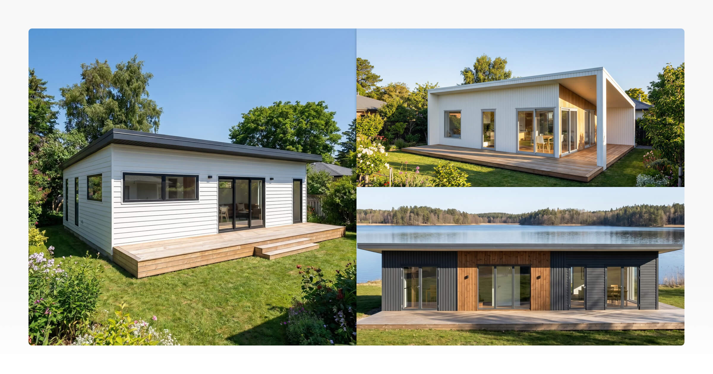
Landscape is the natural 3D rendering format for architectural photography. A wide frame gives a home room to breathe. It communicates scale, setting, and exterior design in a way that portrait or square framing can't.
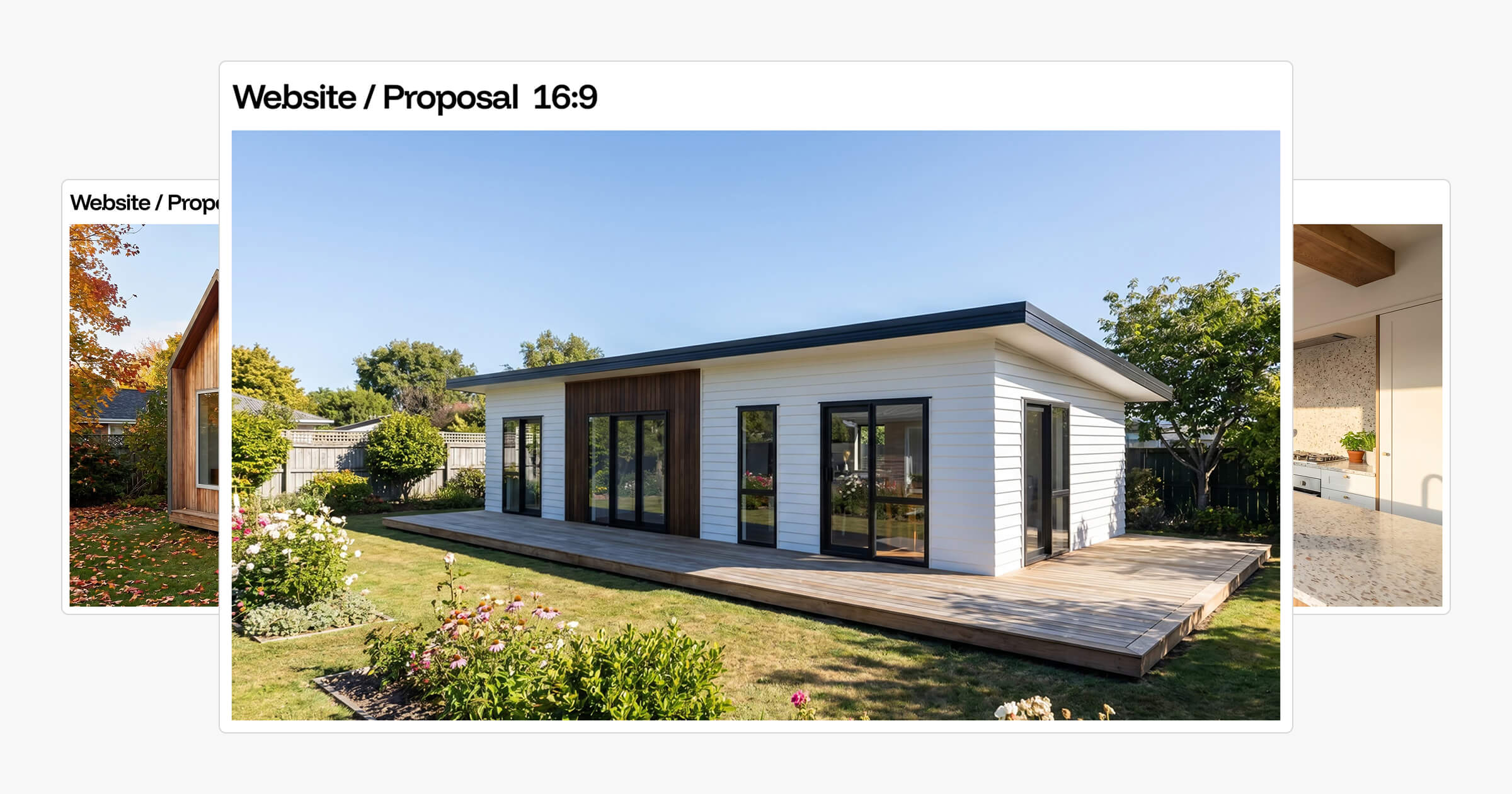
The 16:9 ratio is the most widely used landscape format. As of 2026, it matches the display proportions of virtually every website layout, YouTube thumbnail area, and widescreen monitor. For a website hero section (the large image above the fold), 16:9 fills the space without cropping and creates a strong first impression. It also works well for Facebook and LinkedIn banners, where cover areas are horizontal.
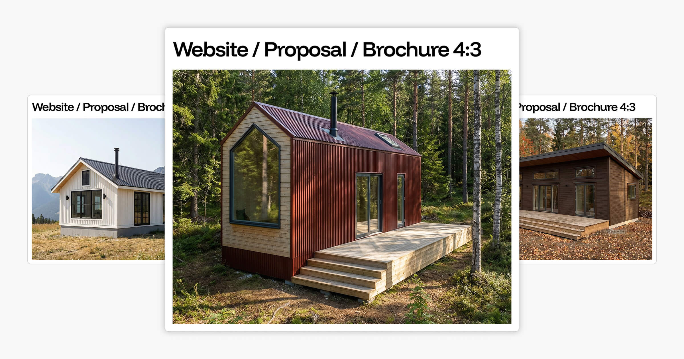
The 4:3 ratio is more compact. It fits cleanly into printed brochure layouts, proposal cover pages, and PDF templates where 16:9 creates too much horizontal stretch. A 4:3 render pairs naturally with A4 and letter-format pages without leaving awkward gaps at the sides.
Landscape renders feel architectural and considered. That quality is an advantage when you're establishing context, placing a home in its surroundings, showing the full exterior, or setting the tone for a proposal. It's the format that says "here's the full picture."
The limitation shows up on mobile. A 16:9 image in a vertical phone scroll appears as a narrow horizontal strip in a large vertical space. The render might be excellent, but the format works against the platform. For mobile-first channels, portrait takes over.
Want to see how your designs translate across landscape formats and environments? Explore the AI Render Tool to generate format-specific renders from your existing designs.
Portrait Renders for Instagram and Mobile: Formats Built for Vertical Screens
Portrait renders are built for the way most people consume content today: on a phone held vertically, scrolling through a feed. A portrait image fills the screen. A landscape image doesn't.
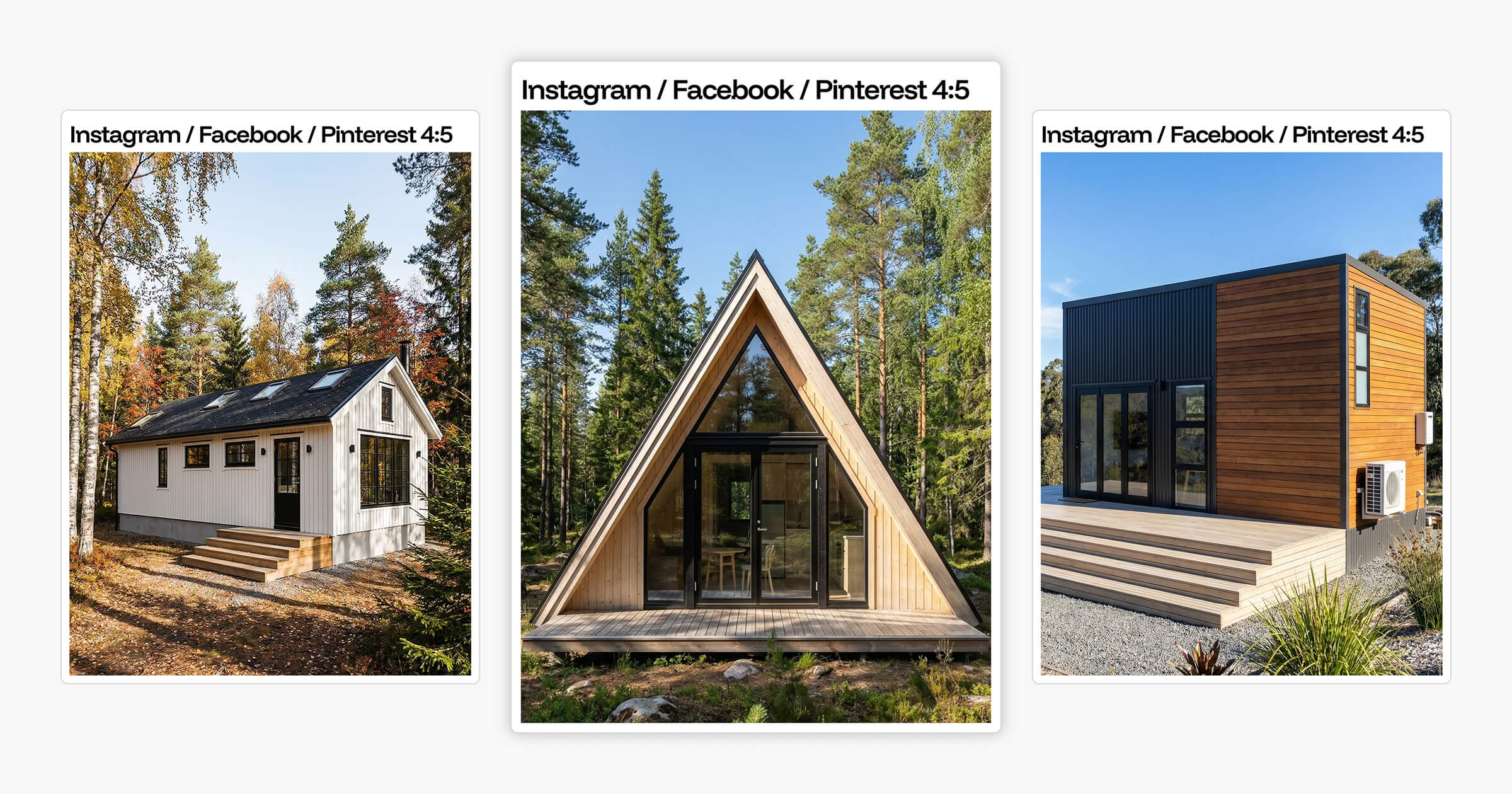
The 4:5 ratio is what Instagram recommends for feed posts. Instagram noted that 4:5 is the preferred format for image posts, and the math explains why: a 4:5 image is 25% taller than a 1:1 square in the same display width. In a grid layout, 4:5 images take up more scroll space per post, which means more of the render is visible before the viewer scrolls past.
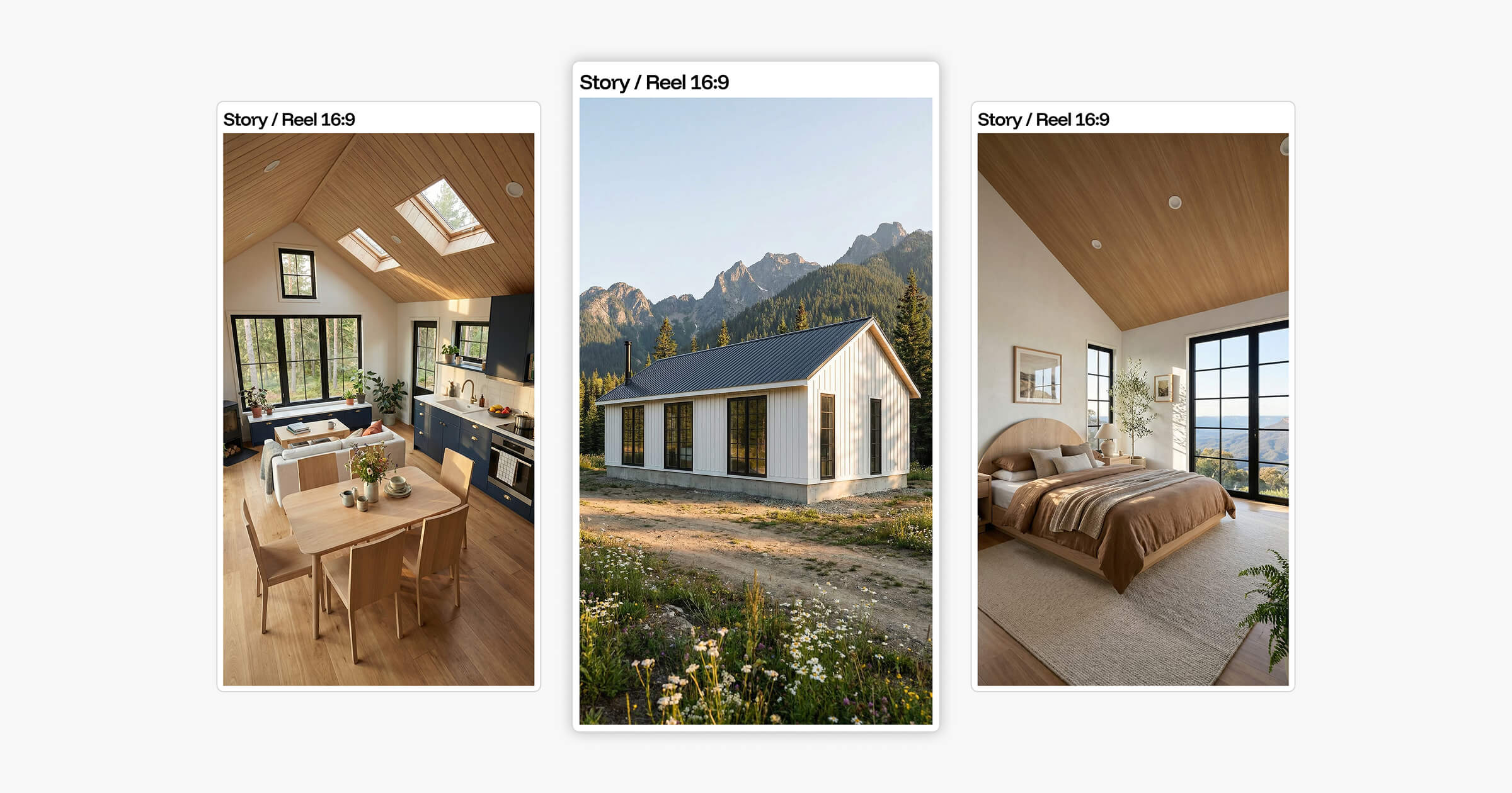
The 9:16 ratio is designed for full-screen vertical content: Stories, Reels, TikTok, and Pinterest Idea Pins. A 9:16 render fills 100% of a portrait phone screen with no dead zones. The viewer's attention has nowhere else to go.
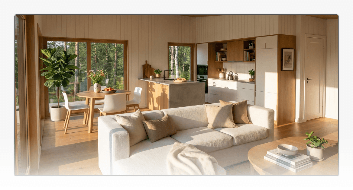
Portrait renders do something landscape can't: they focus attention on specific design moments rather than wide exterior views. A portrait frame of a kitchen, bathroom, loft, or cabinetry run keeps the eye on one thing. For builders who want to highlight material quality, interior finishes, or layout decisions, portrait framing works better than a broad exterior shot.
Portrait renders are also useful inside proposals, not just on social media. The cover page might use a landscape render for the full exterior view. Interior pages benefit from portrait renders that say "here is the detail," giving clients a closer look at specific rooms or moments they've already asked about. Landscape establishes the overview. Portrait communicates the specifics.
For builders looking to sharpen how they use visual content across social media channels, the Instagram post guide for small home builders covers how to structure and present renders across a builder's Instagram presence.
Square Renders: The Versatile Middle Ground
Square renders sit between landscape and portrait. At a 1:1 ratio, they're format-neutral enough to work across multiple placements without reformatting, and they fit naturally into grid-based layouts where consistent image sizing matters.
For builders, square renders work well for:
Instagram grid layouts where visual consistency across posts is a priority
Online marketplace listings and directory pages that display images uniformly
Website photo galleries showing multiple designs side by side
Promotional tiles and ad graphics used across social media or email marketing
The practical strength of a square render is flexibility. It doesn't need to be reformatted for a wide banner or a tall feed post because it sits between both. For builders who want one render to cover multiple placements without creating separate versions, 1:1 is the most practical choice.
The limitation is compositional. A square frame gives less creative room than landscape or portrait. Wide exterior views feel compressed; tall vertical spaces feel truncated. A render that reads as spacious and architectural at 16:9 can feel constrained at 1:1.
Square works best as part of a broader render strategy. It's useful for placements where consistency matters, but it isn't a replacement for landscape or portrait when those channels are the priority.
Planning Your Render Formats by Channel
The simplest way to manage render format decisions is to plan your render format for website, print, and social channels before generating images. This prevents the common problem of generating one default render and adapting it poorly across multiple uses.
Channel | Format | Ratio |
|---|---|---|
Website hero section | Landscape | 16:9 |
Proposal cover page | Landscape | 5:4 |
Brochure or printed marketing | Landscape | 5:4 |
Facebook cover or banner | Landscape | 16:9 |
Instagram feed post | Portrait | 4:5 |
Instagram Stories / Reels | Portrait | 9:16 |
Pinterest Idea Pin | Portrait | 9:16 |
Instagram grid or website gallery | Square | 1:1 |
Marketplace listing | Square | 1:1 |
Promotional tile or ad graphic | Square | 1:1 |
Working from a channel map before a render session means builders can generate the right format for each output in one go, rather than going back to re-render when a landscape image doesn't work on Instagram or a square render looks underpowered on a proposal cover.
For builders who want a full framework for how renders fit into their overall digital presence, the marketing guide for small home builders covers how to build a consistent visual identity across every channel.
Render Settings for Builders: How Environment Controls Shape What a Format Communicates
Getting the format right determines where a render works. The environmental settings determine what it communicates once it's there.
A cabin exterior in a summer mountain setting communicates outdoor lifestyle and leisure. The same cabin in an overcast autumn environment communicates a quieter, more intimate retreat. Neither version is more accurate. They speak to different buyers in different contexts.
The best way to think about render settings is to ask: "what would my buyer be doing when they see this?" Season, environment, and time of day all flow from that question.
Tiny Easy's AI Render Tool includes four environment controls. Here's what each one does and when to use it:
Setting | Options | Best Use Case |
|---|---|---|
Seasons | Spring, Summer, Autumn, Winter | Match the lifestyle your audience imagines; summer for Instagram, autumn for cosy retreat proposals |
Environments | Forest, Coastal, Rural, Mountain | Match the regional setting where you sell; Pacific Northwest needs different framing than coastal Queensland |
Time of Day | Morning, Golden Hour, Night | Golden hour for social media warmth; night renders with lit interiors work well on proposal pages |
Weather | Clear, Overcast, Atmospheric | Clear sky reads aspirational; overcast reads architectural and considered |
These aren't just aesthetic choices. They're the settings that make a render feel like "this home belongs in my life" rather than "this is a generic 3D model." For AI rendering for marketing, these controls replace hours of manual scene setup with a single workflow step.
In traditional rendering workflows, adjusting these variables means rebuilding the lighting setup, sourcing new HDRI environment maps, repositioning scene assets, and re-rendering from scratch. It's time-intensive, technically demanding, and requires specialist knowledge or outsourced production. The full picture of what that process involves is covered in Effective 3D Rendering Workflow Optimization Techniques.
In Tiny Easy, these settings are selectable options within the same render session. Builders can generate a summer exterior, an autumn exterior, and a night exterior from the same base design in one workflow, each formatted correctly for its intended channel.
Ready to test the settings on your own designs? Explore the AI Render Tool or book a demo to walk through it with the team.
Renders as Communication Tools Across the Sales Process
Renders aren't just visual outputs. They're communication tools used at different stages of the sales process, and each stage has different format requirements.
Early in the funnel, a builder's website and social media need renders that attract attention and establish the visual identity of the business:
A landscape render in the website hero section creates a strong first impression
Portrait renders on Instagram and Pinterest keep the business visible in feeds where potential clients are spending time
Square renders in a website gallery give visitors a consistent, browsable overview of the design range
Later in the process, renders move into proposals. The format requirements shift. A 5:4 landscape render works well on a proposal cover page: it fills the space cleanly and sets a professional tone for the document that follows. Portrait renders at 4:5 work well for interior pages that focus on specific rooms, finishes, or layout moments a client has already asked about.
The render format stops being a social media decision and becomes a presentation decision.
Tiny Easy's Proposal Builder connects directly to renders from the AI Render Tool. Builders can generate the right format for the right page and drop it into the proposal layout without moving files between different tools. The design, the render, and the proposal all stay in the same workflow.
The render format decision and the settings decision aren't choices to make at the end of a design session. They're workflow decisions that determine whether a visual communicates "the right idea to the right buyer at the right moment," from the first impression on a website to the moment a client signs off on a proposal.
Frequently Asked Questions
What is the best render format for an Instagram feed post?
What aspect ratio should I use for a proposal cover page?
What is the difference between lanscape and portrait 3D renders?
Do I need different renders for my website and social media?
What render settings have the most impact on how a render performs in marketing?
Conclusion
The three types of 3D rendering format, landscape, portrait, and square, aren't interchangeable. Each works in a specific context, fills a specific space, and communicates a specific kind of idea.
Landscape fills websites and proposal covers. Portrait owns Instagram feeds, Stories, Pinterest, and mobile-first content. Square provides flexibility for galleries, grid layouts, and promotional graphics. And the environmental settings behind each render, season, surroundings, lighting, and weather, determine whether the visual speaks to the right buyer in the right context.
Builders who plan their render formats by channel, and match their environment settings to their audience, produce stronger marketing assets and more professional proposals from the same base design.
Tiny Easy's AI Render Tool supports all five format ratios: 16:9, 4:3, 4:5, 9:16, and 1:1, with environment, season, time of day, and weather controls built into a single render session. No manual scene setup. No specialist software. No rebuilding from scratch when a setting changes.
To see how the tool fits your marketing and proposal workflow, explore the AI Render Tool or book a demo to walk through it directly.


About the Author
Eujenne | Co-founder of Tiny Easy and has 8+ years of experience in the tiny house and small home industry.
She built her own tiny home on wheels with her partner and co-founder Laurin, and has designed several popular Tiny Easy concept homes, including the Scandi, Petite Maison, and 10x10 Tiny House on Wheels. At Tiny Easy, Eujenne works across UI/UX, product education, content marketing, and builder resources, helping small home businesses use 3D design and visual sales tools to improve their design, sales, and client communication workflows.