Shed Design



About Myrtle
0
0
120 Sqft
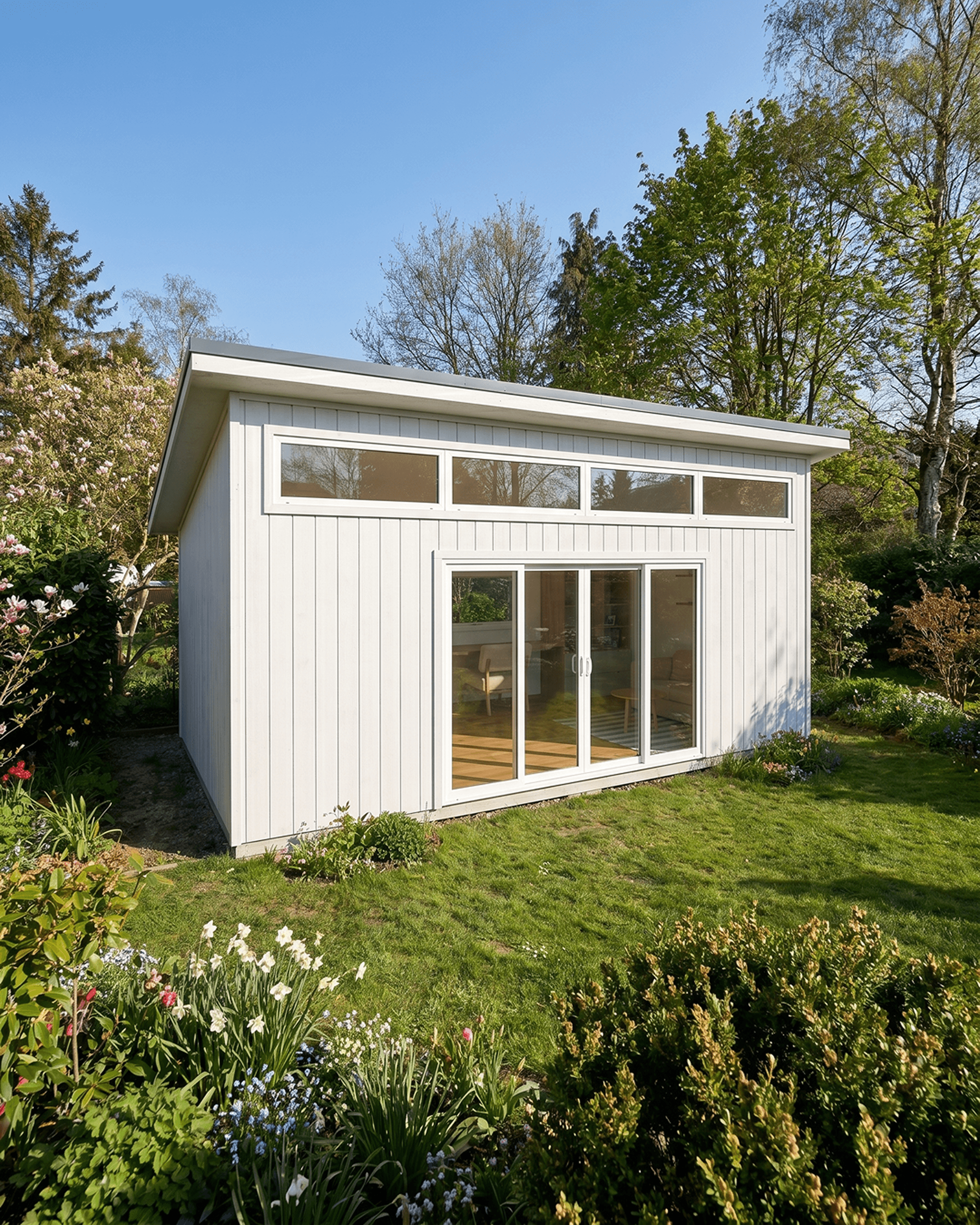
Myrtle is a 12x10 shed concept designed to work as more than a storage space, it's built to function as a home office, creative studio, or quiet backyard retreat. A traditional, Scandi-inspired exterior sets a calm tone outside, while a considered interior brings together natural oak finishes, a full-height bookcase, and two distinct zones: a desk workspace and a lounge armchair facing the garden. It's a compact footprint designed to earn its keep.
Cabin Design Specifications
Dimensions
Imperial: 12ft x 10ft x 10.4ft
Metric: 3.65m x 3.05m x 3.2m
Layout
Desk Workspace
Lounge Retreat
Overall Floorspace
120 sqft
11.1 m2
Design Type
Sheds / Garden Homes / Office Pods
Sleeps
For 1 Person
1x Desk/Study Area
Plans/Blueprints Available
PDF ADU Plans
Available in metric & imperial
Software Used:
Design from scratch or, customize templates with 3D Designer
Plans Exported With:
Export with instant generate plans tool & Take off tool in 3D Designer
Images Generated With:
Images generated with AI Render Tool add-on for 3D Designer
Step inside this Shed design and explore every corner at your own pace with our interactive 3D Viewer.
The Design Concept Overview
Myrtle takes the familiar 12x10 shed footprint and gives it a clear second purpose. Rather than reading as a plain storage structure, the design is built around two everyday uses: a proper desk workspace and a comfortable spot to sit and unwind. The result is a small, self-contained space that can work as a home office, a creative studio, or simply a peaceful escape from the main house.

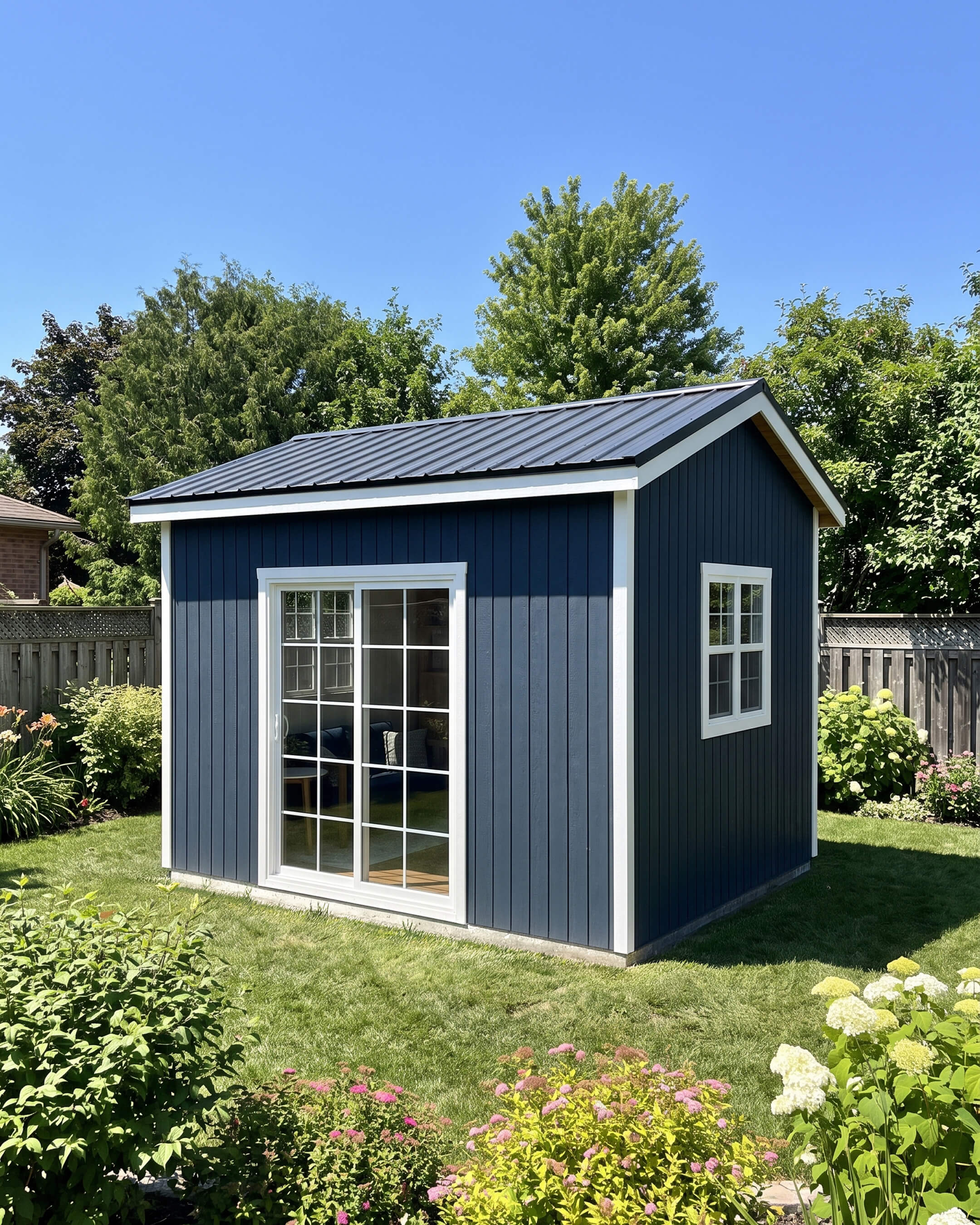
The exterior leans into a traditional, Scandi-inspired look. A gable roof, navy vertical timber cladding, crisp white trims, and sash windows give Myrtle a tidy, considered presence that suits a garden setting without shouting for attention. Step inside and the mood shifts to something warmer. Natural oak finishes, light blue panelling, and dark blue upholstered furniture create a palette that feels more like a cosy nook than a utility shed.
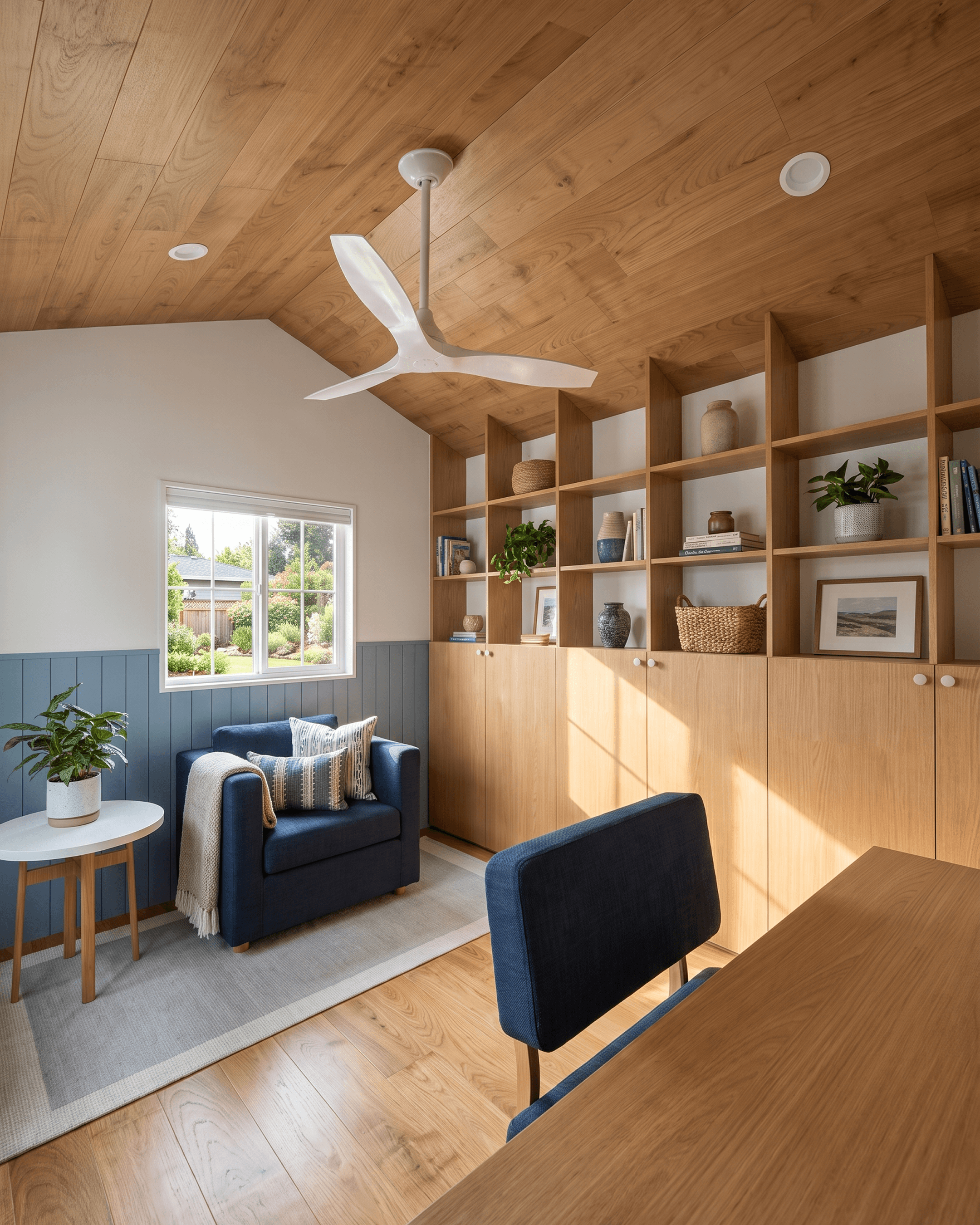
The interior logic centres on a full-height, floor-to-ceiling bookcase that runs the depth of one wall. It combines hidden cabinet storage with open shelving, giving the room a place to keep everyday clutter out of sight while still displaying books and favourite objects. On either side of that anchor piece, the room splits into a generous desk workspace and a lounge armchair angled toward the garden.
Myrtle suits homeowners who want a backyard structure that earns daily use, whether that's a dedicated place to work from home, a studio for creative projects, or simply a small retreat that feels separate from the rest of the house. It's not trying to be a bedroom or a full residence. It's solving a narrower problem: how do you fit a workspace and a place to relax into one small, well-built room?
Myrtle at a Glance
Feature | Detail |
|---|---|
Design | Myrtle, 12x10 shed |
Footprint | 12ft x 10ft (3.65m x 3.05m) |
Height | 10.4ft (3.2m) |
Floor area | 120 sqft (11.1m2) |
Exterior style | Traditional Scandi-inspired, gable roof |
Exterior cladding | Navy vertical timber with white trims |
Windows | Sash windows |
Interior finishes | Natural oak, light blue panelling, dark blue upholstery |
Storage | Full-height bookcase with hidden cabinets and open shelving |
Zones | Desk workspace + lounge armchair |
Myrtle Exterior Design
The exterior of Myrtle follows a traditional, Scandi-inspired approach: a simple gable roof form, a tidy footprint, and a material palette that reads as considered rather than purely utilitarian. It's the kind of look that doesn't try too hard, and that's exactly the point. A backyard structure needs to sit comfortably in its setting, not compete with the main house.
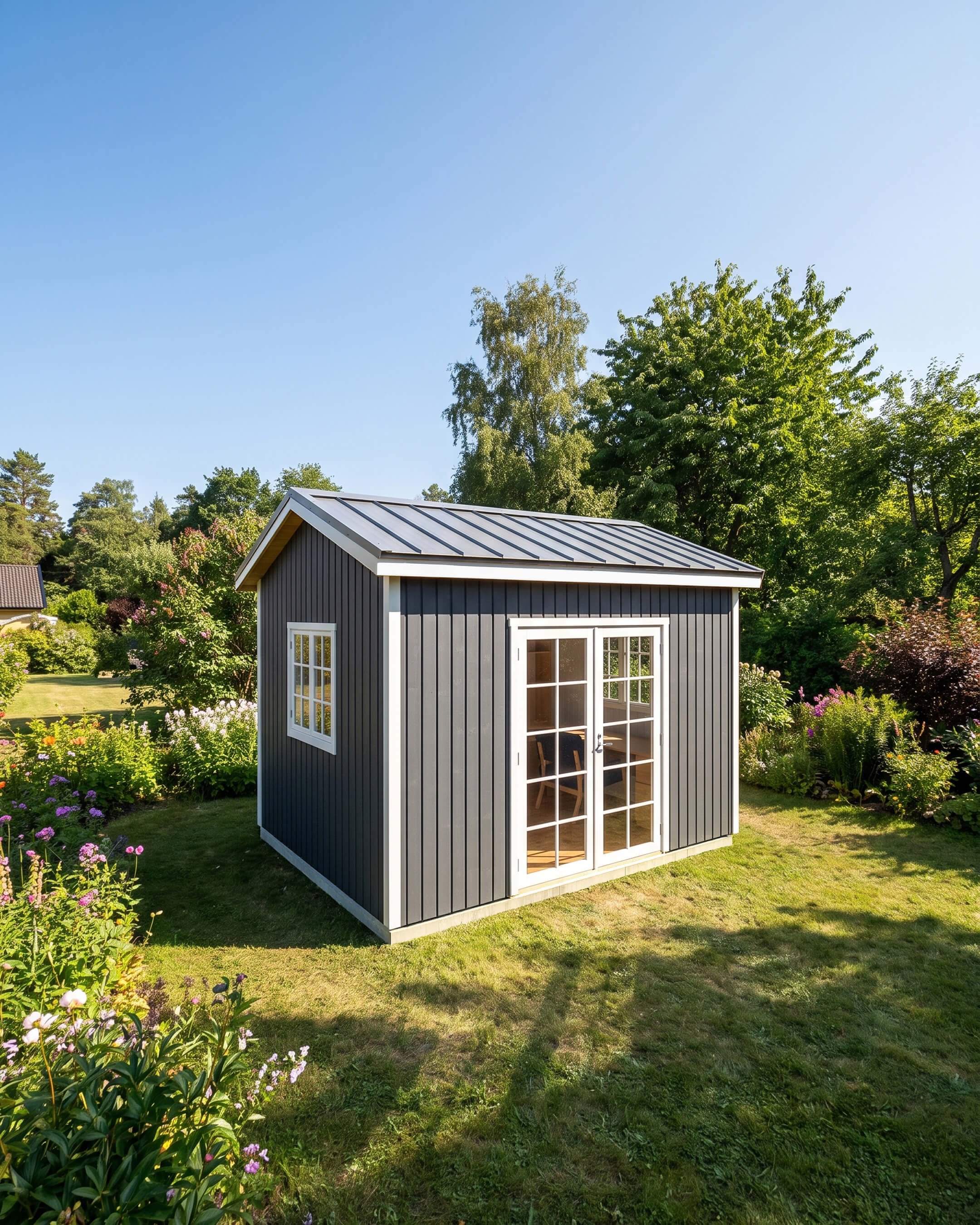
Key exterior features:
Traditional Scandi-inspired exterior style with a gable roof
Navy vertical timber cladding
White trims framing the cladding and roofline
Sash windows
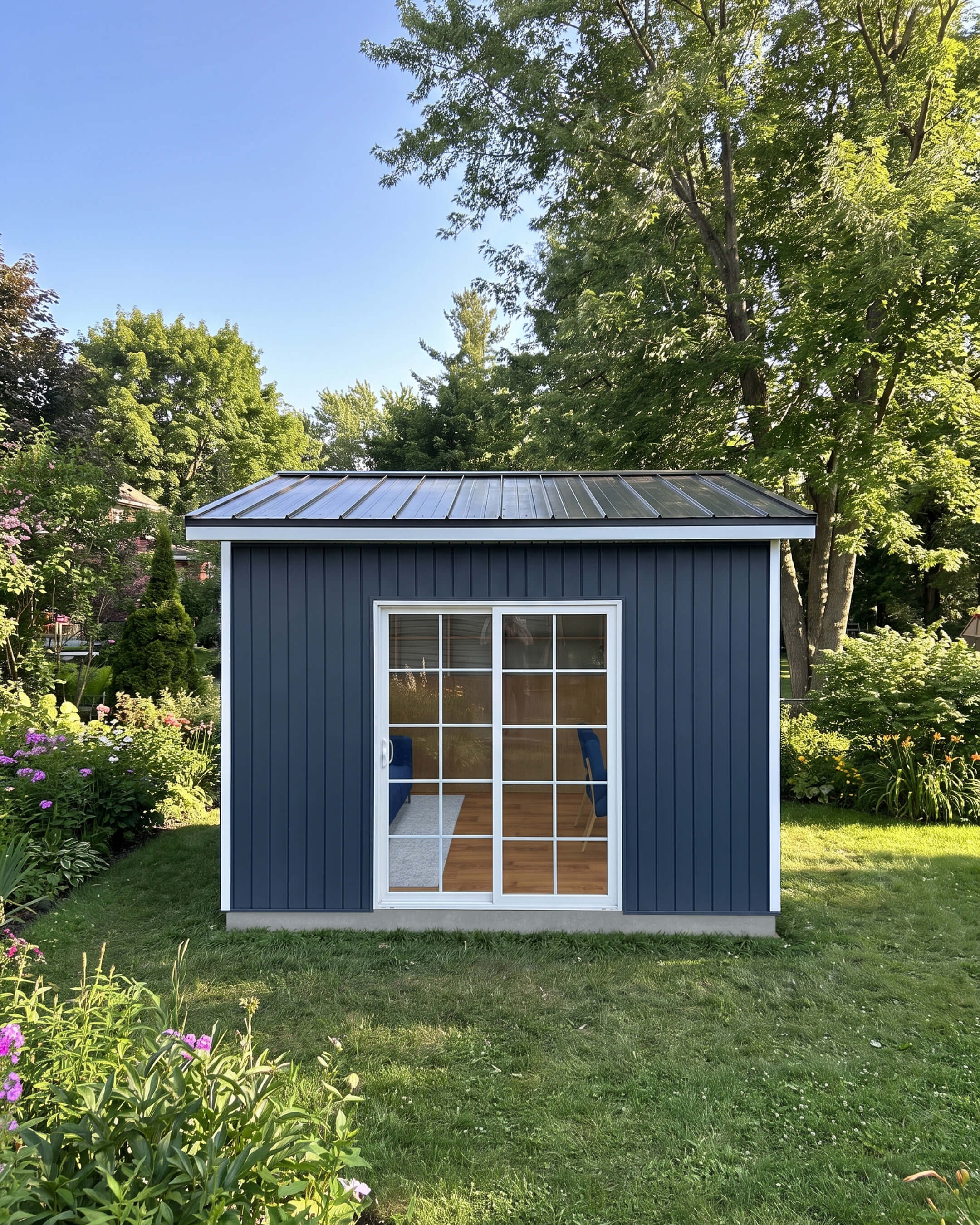
The navy cladding and white trims give Myrtle a crisp, classic look that sits comfortably in a garden or backyard setting, whether the surrounding context is a lawn, a deck, or a planted border. The vertical timber boards add texture and a sense of craft, while the white trims keep the whole elevation looking sharp rather than heavy. Sash windows reinforce the traditional character while still letting in natural light for whatever the space is being used for inside.
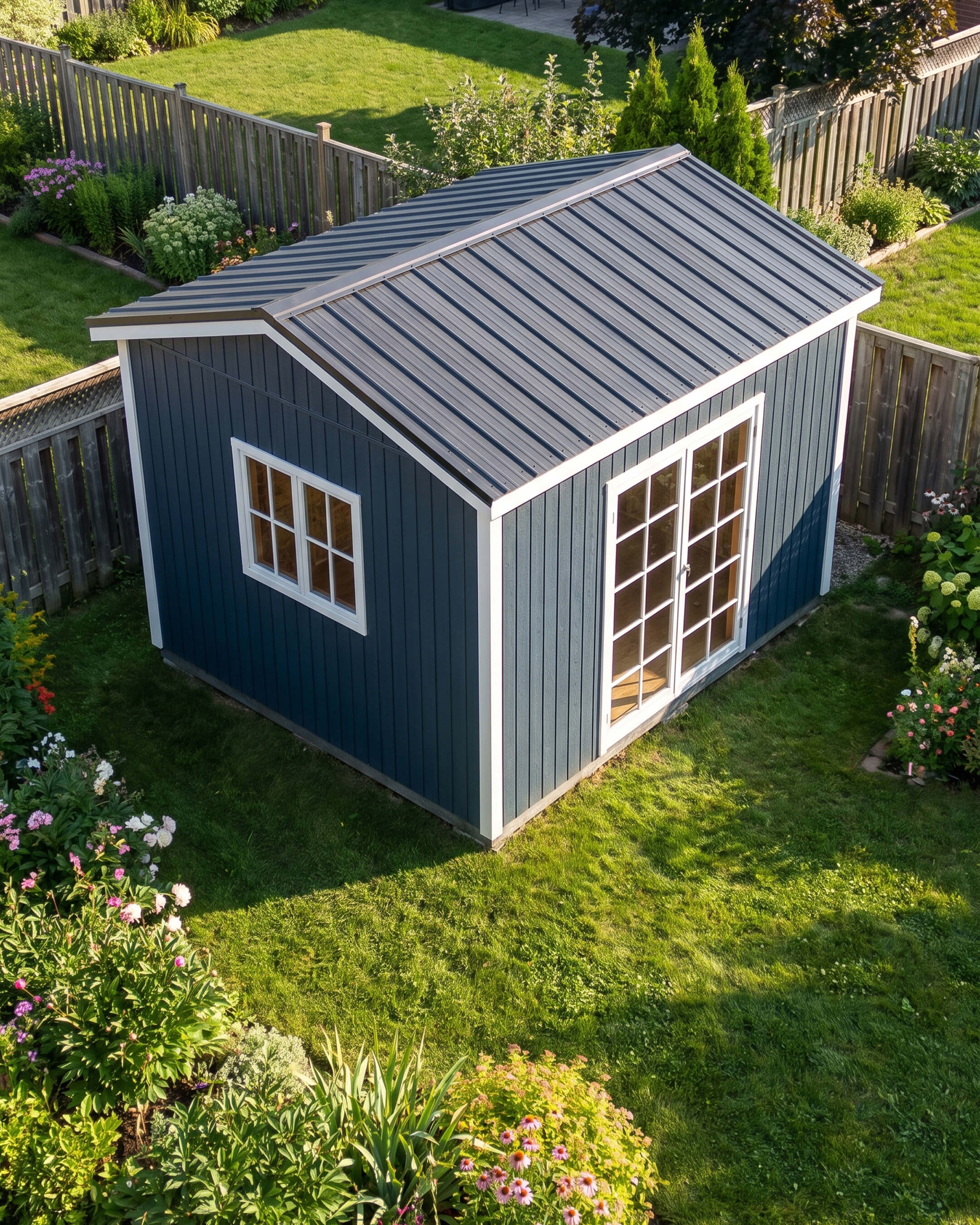

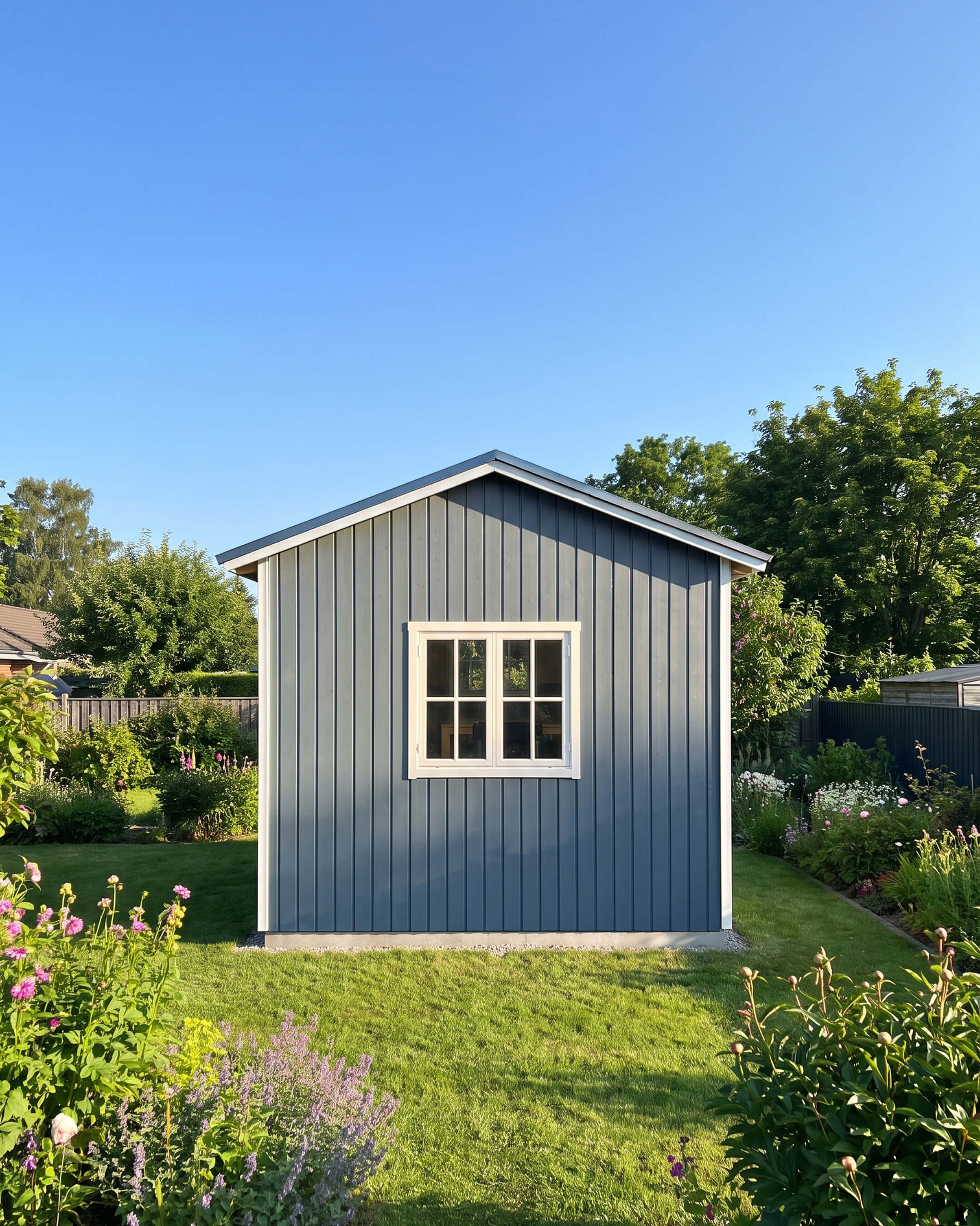
At a 12ft x 10ft footprint (3.65m x 3.05m), Myrtle keeps a compact, easy-to-site scale. It's the kind of structure that reads clearly as a backyard addition rather than a competing building, which makes it straightforward to place on most residential sections without overwhelming the existing garden or yard.
Interior: Workspace & Storage
One side of Myrtle is arranged as a proper desk workspace, not an afterthought squeezed into a corner. The desk is generously sized for the footprint, giving whoever uses the space enough room to actually work, sketch, or create without feeling boxed in.
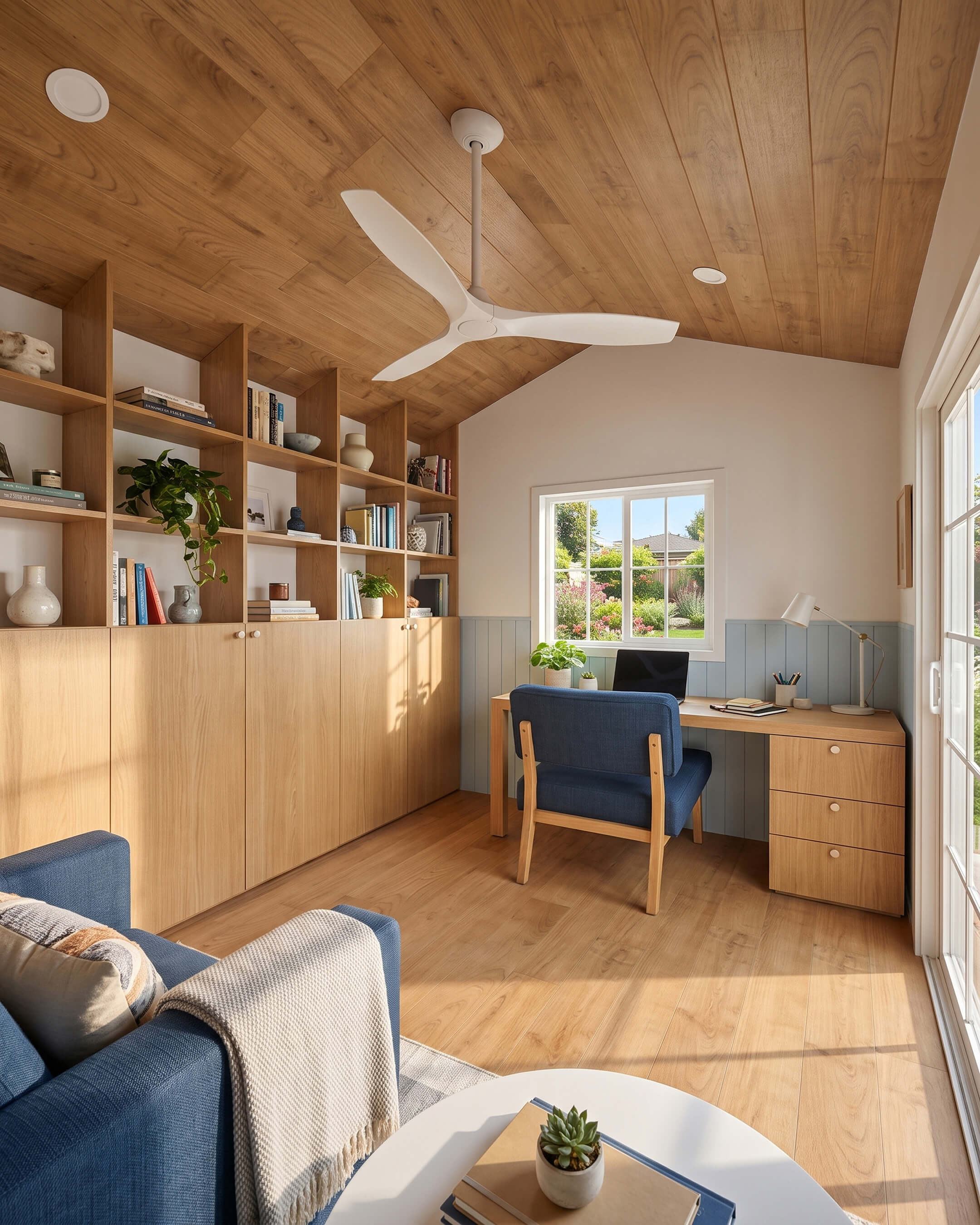
Storage is handled by the full-height, floor-to-ceiling bookcase built into the room. It combines hidden cabinet storage below with open shelving above, so the workspace can stay tidy while still having a place to display books, plants, or personal objects. That's a small detail that matters a lot in a 120 sqft room: everything needs a place, or the space starts to feel cluttered fast.
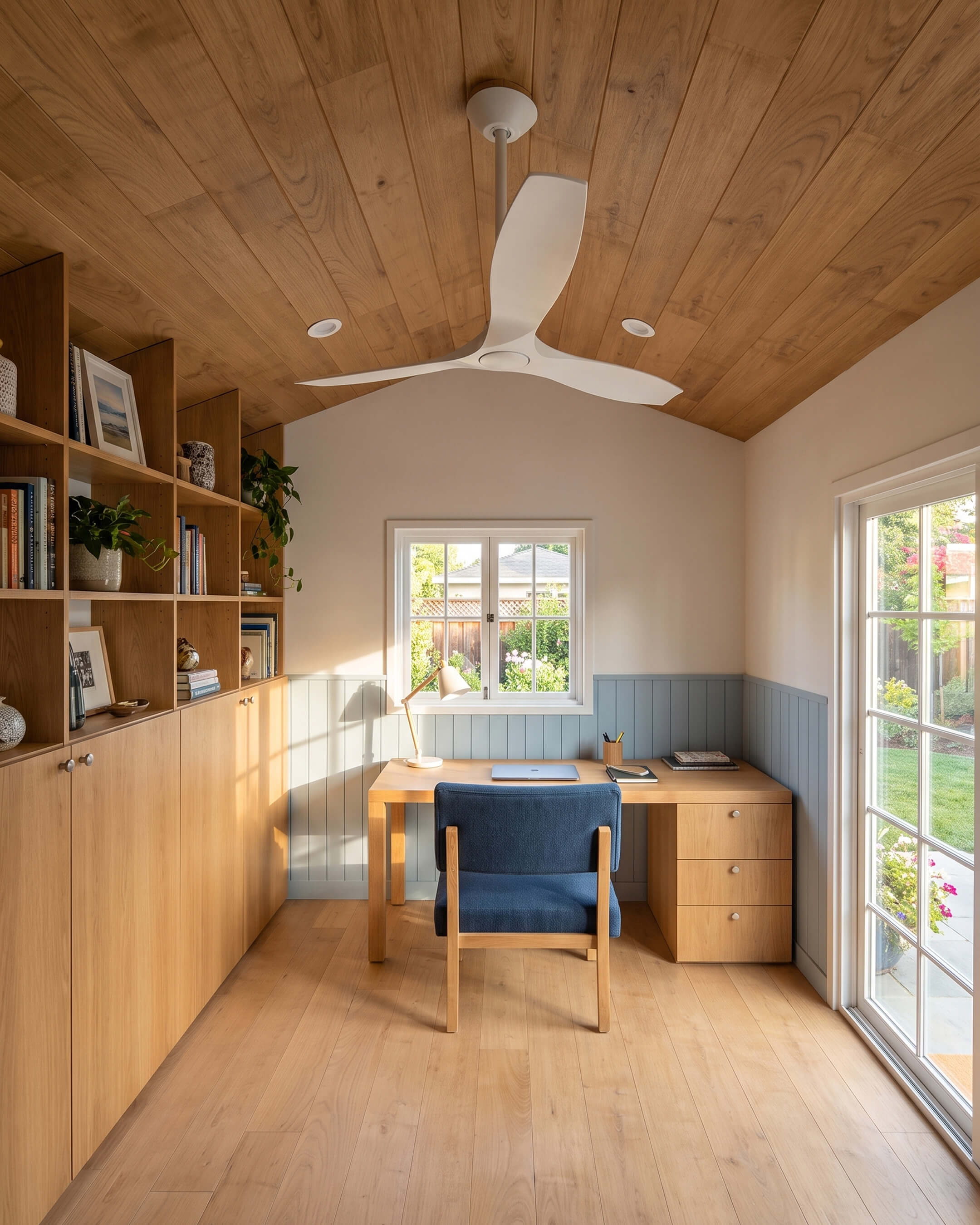
Natural oak finishes on the joinery and flooring keep the workspace warm rather than clinical, and the light blue panelling on the walls adds a calm, considered backdrop that doesn't compete with the work itself. Together, these choices give the workspace a settled, grounded feel rather than a temporary or improvised one.

Positioned this way, the workspace zone gives Myrtle a genuine reason to be used daily. It's a place to sit down and focus that's separate from the main house, which can make a real difference for anyone who works from home and needs a bit of physical distance from household distractions.
Interior — Lounge
On the other side of the room, a lounge armchair is positioned to face the garden, giving Myrtle a second, more relaxed use case alongside the workspace. The dark blue upholstered armchair anchors the space and pairs with the same oak finishes and light blue panelling used throughout the interior, so the two zones feel like one considered room rather than two mismatched halves.

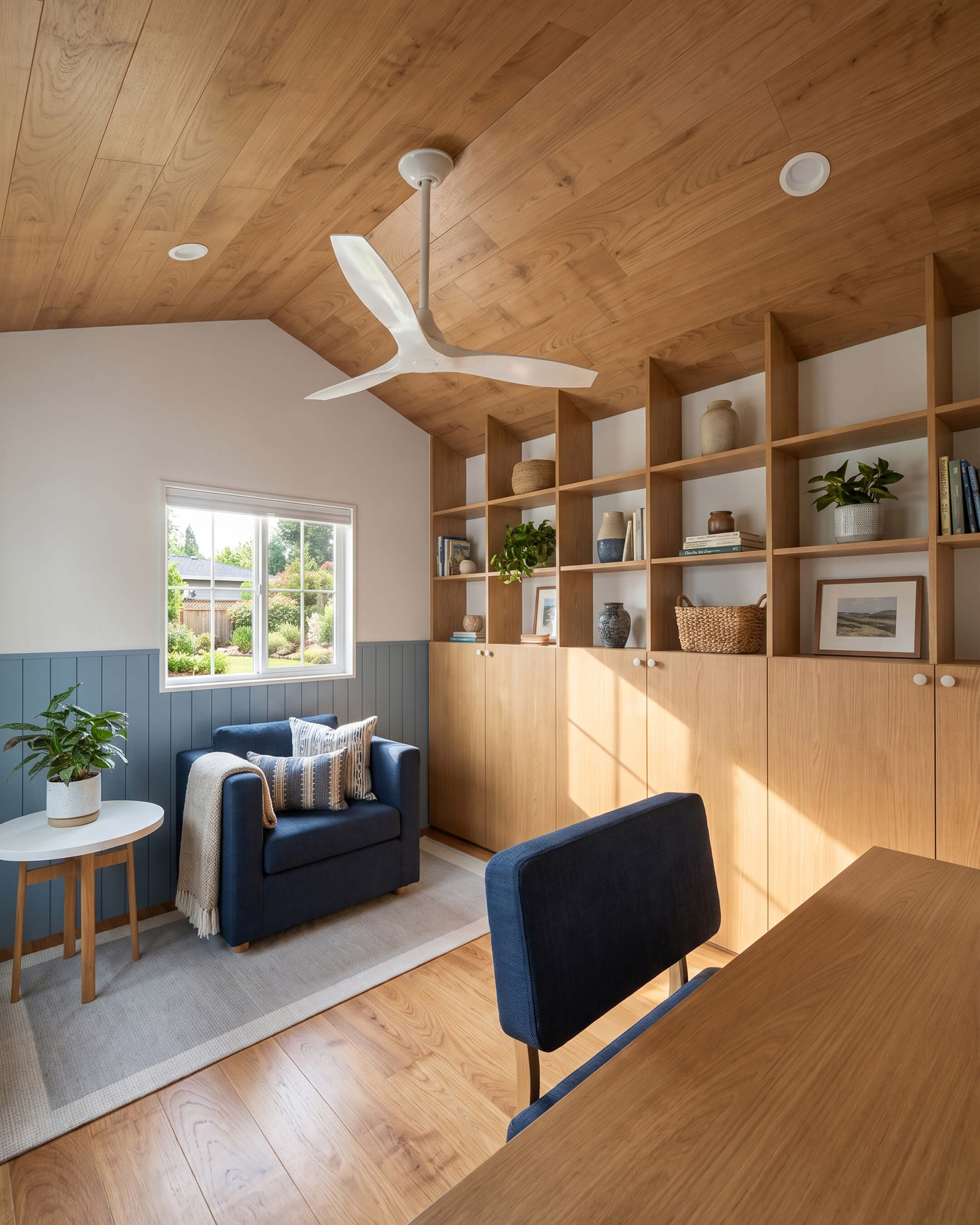
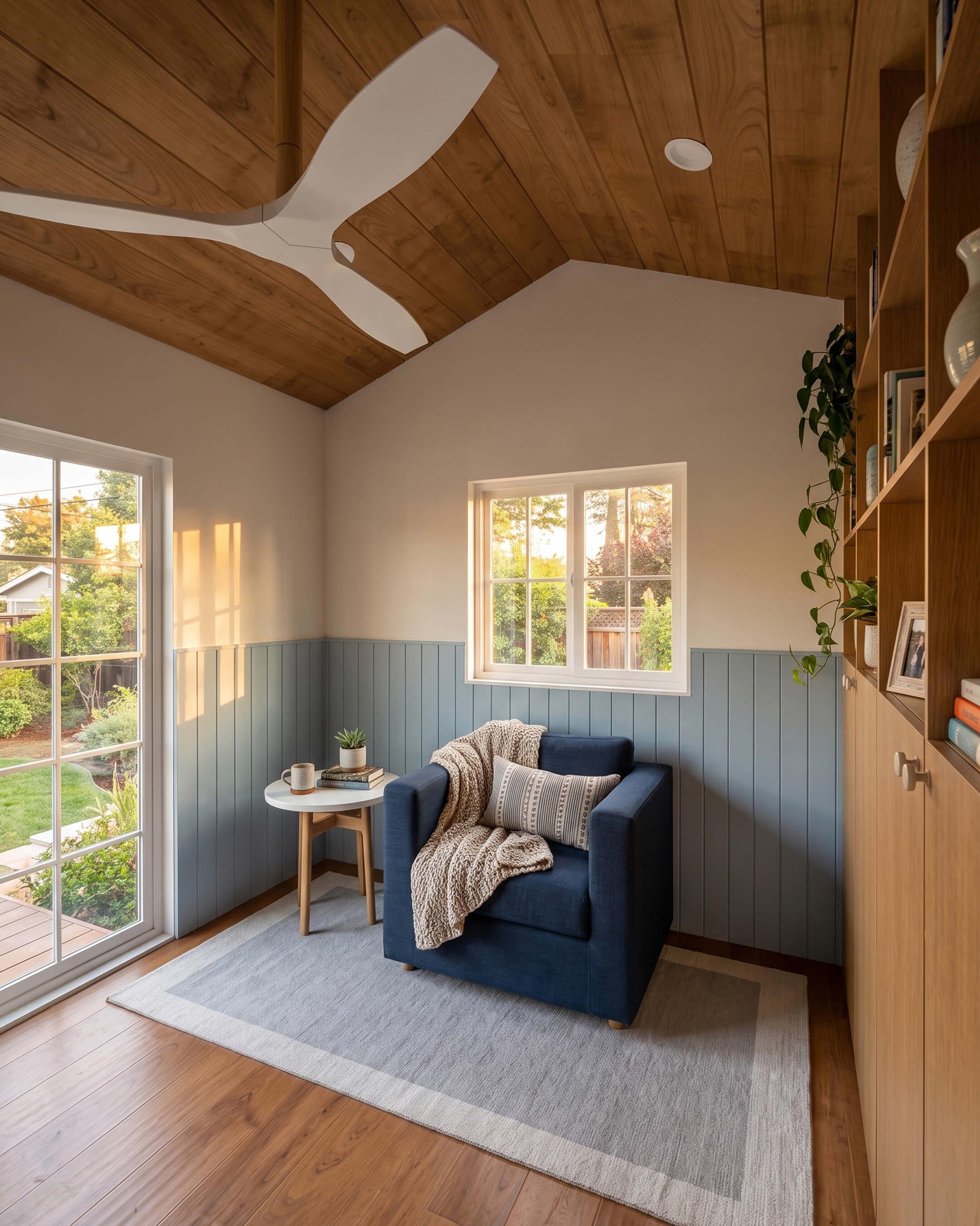
The lounge zone benefits from the sash windows on the exterior, which bring in natural light and frame the outlook onto the garden. It's a straightforward addition to the layout, but it changes what Myrtle can be used for. It could be a reading spot, a place to pause during the day, or simply a quiet corner that isn't the desk.
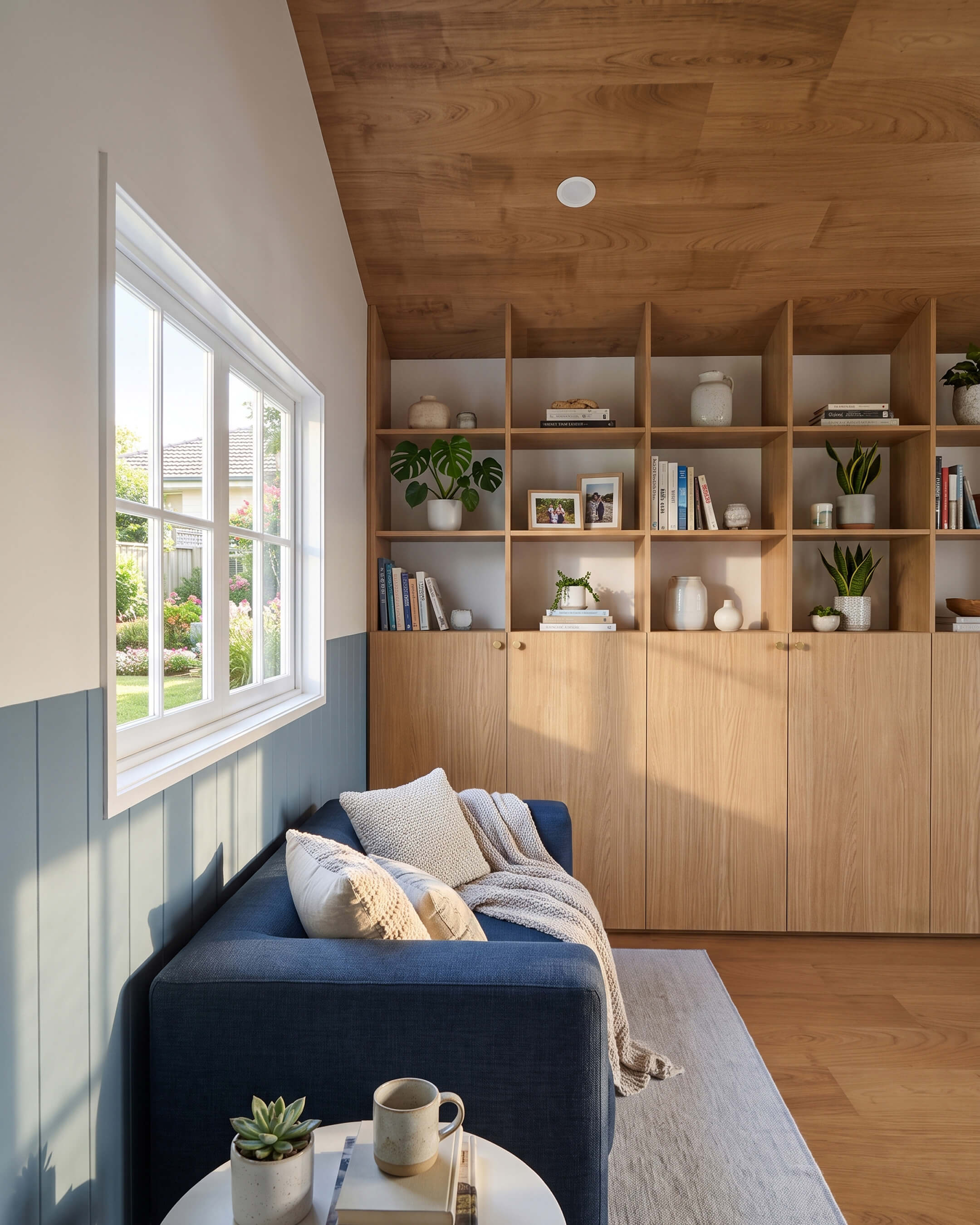
Together, the workspace and lounge zones make Myrtle function as a flexible one-room retreat rather than a single-purpose structure, with the bookcase acting as the visual and practical divide between the two. That layout logic, one anchor piece splitting two zones, is a simple idea that's easy to explain to a client and easy to visualise in a render.
Materials & Palette
Myrtle uses a consistent, small palette both inside and out. Here's a quick reference:
Material / Finish | Where it appears |
|---|---|
Navy vertical timber cladding | Exterior walls |
White trims | Exterior cladding edges and roofline |
Sash windows | Exterior, workspace, and lounge zones |
Natural oak | Joinery, bookcase, and flooring |
Light blue panelling | Interior walls |
Dark blue upholstery | Lounge armchair |
Keeping the palette this tight is part of why Myrtle reads as calm rather than busy. Two or three colours repeat throughout the room, so the eye doesn't have to work hard to make sense of the space.
Placing Myrtle in the Garden
At 120 sqft, Myrtle is small enough to tuck into a corner of a backyard without dominating it, but large enough to hold a real desk and a comfortable armchair without feeling cramped. That balance is part of the appeal for a design like this: it doesn't ask for much space, but it still delivers a proper room rather than a glorified box.
A few things worth considering when picturing Myrtle on a real site:
Orientation toward the garden matters, since the lounge zone is built around that outlook
The sash windows work well on an elevation that gets reasonable natural light through the day
A gable roof form is a familiar, easy-to-read silhouette that tends to suit a range of backyard settings
As with any backyard structure, exact placement, foundations, and local approvals depend on the site and should be confirmed with a qualified local professional before building.
The Two Zones
Zone | Location | Anchored by |
|---|---|---|
Workspace | One side of the room | Desk + oak-finished bookcase joinery |
Lounge | Opposite side, facing the garden | Dark blue upholstered armchair |
Storage | Between the two zones | Full-height bookcase, hidden cabinets + open shelving |
Who Myrtle Is For
Myrtle is a good fit for a few different use cases:
Homeowners who want a dedicated home office away from the main house
Creatives who need a quiet studio for writing, art, or hobby work
Anyone looking for a calm backyard retreat that still feels finished and considered
Builders who want a compact shed design that reads as more than basic storage in their model range
It's not positioned as a bedroom, a guest suite, or a full secondary dwelling. There's no bed and no bathroom in this concept. What Myrtle does offer is a small, well-resolved room that earns its keep every day, which is a practical starting point for a backyard structure compared to a larger, less-defined space.
For builders, Myrtle is a straightforward concept to present. The story is simple: one anchor piece, two zones, a tight material palette. That makes it an easy design to walk a client through, whether they're picturing a home office, a studio, or just a quiet spot to escape to after a long day.
The 12x10 shed category covers a wide range of builds, from bare-bones tool sheds to fully lined garden rooms. Myrtle sits firmly at the considered end of that range. It's not a blank box waiting to be fitted out later. Every surface, from the bookcase to the armchair upholstery, is already part of the design story, which makes it easier for a buyer to picture the finished result rather than an empty shell.
Myrtle in Summary
Myrtle takes a straightforward 12x10 shed footprint and turns it into a considered, dual-purpose retreat. There's a desk workspace on one side, a garden-facing lounge on the other, and a full-height bookcase holding it all together. The traditional Scandi-inspired exterior and warm oak-toned interior give it a finished, livable feel that goes beyond basic storage.
If you're a builder looking to add a design like Myrtle to your model range, book a demo with the Tiny Easy team to see how you can design, visualise, and present shed and backyard studio concepts like this to your clients. Browse more shed designs for further backyard studio and workspace inspiration.
Want to explore the tools that brought Myrtle to life? Learn more about Tiny Easy's 3D Designer and the AI Render Tool.
*Design and renders created in Tiny Easy's 3D Designer and AI Render Tool. All images are design visualisations for inspiration and concept demonstration purposes only. They should be reviewed by a qualified builder, architect, draftsperson, or engineer before use for any construction or site-specific decision-making.
How We Designed this Cabin Concept
Every part of this cabin plan concept, from the exterior details to the interior layout, was designed entirely within the Tiny Easy platform. No third-party tools, no hand-drawn floor plans, no outsourced renderings. From the first concept through to final handoff documents, the whole process lived in one place.
Design Creation
For builders, one of the biggest bottlenecks in turning interest into a real sales conversation is the time it takes to get a clear design in front of a client. Traditional 3D design tools can be slow to learn, and relying on a designer or draftsperson for every early concept can add cost and delay before the client has even had a chance to properly understand the home.
The 3D Designer is Tiny Easy’s design workspace for creating, managing, and tailoring tiny homes, cabins, granny flats, ADUs, and more within one connected system. Builders can use it to build out their core model range, save designs as reusable templates, test new ideas, explore layout options, and refine their designs over time.
Inside the Designer, the structure can be shaped using tools like Foundation, Shell, and Roof, before completing the model with doors, windows, walls, interior doors, cabinetry, furniture, fixtures, lighting, and finishes. This gives builders a practical way to create complete 3D concepts without needing to start from scratch or rely on complex modelling workflows.
Where this becomes especially valuable is in the sales process. Instead of designing a new cabin from a blank canvas for every enquiry, builders can pull the most relevant model from their existing range into a client project, tailor the layout, finishes, openings, and key details, then present a concept that feels specific to that client.
That speed changes the quality of the conversation. Clients are not left trying to imagine the home from 2D plans, rough sketches, or verbal explanations. They can see the design clearly, understand the layout, explore the options, and build confidence in the direction before moving further into pricing, proposal, or approval.
For builders, the result is a faster and more professional path from enquiry to client-ready cabin concept. The 3D Designer helps turn design into a sales tool, giving builders a repeatable way to respond quickly, communicate clearly, and move serious clients forward while interest is still warm.

Visualization
Once a design is complete, the next challenge is presenting it in a way that actually converts interest into commitment. Traditionally, that meant outsourcing renders to a freelancer — which adds cost, turnaround time, and rounds of back-and-forth — or investing in professional rendering software that requires its own lengthy setup before a single image is produced. For a small home builder running a lean operation, neither is a sustainable way to work.
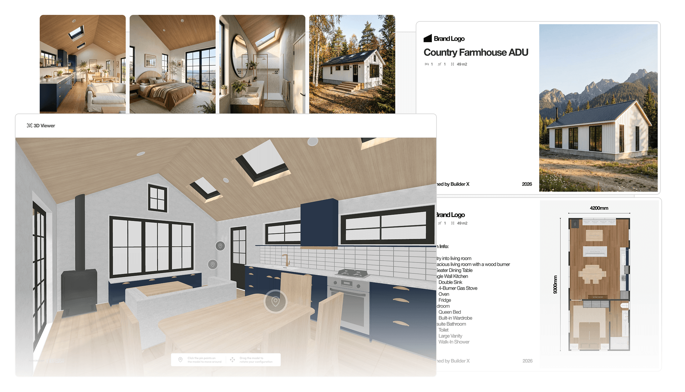
The AI Render Tool takes care of that. Once the design is finalised in the 3D Designer, renders are generated directly from within it. The only setup required is positioning the camera, choosing an environment, setting the time of day and season, and hitting render. The result is a photorealistic image of the home, produced in minutes rather than days — and at a fraction of the cost of conventional methods.
The 3D Viewer Tool adds another layer to the client experience, letting them explore the completed design in interactive 3D from any device. Sharing it is as simple as sending a link. Scale and spatial flow can be difficult to communicate on paper — paired with AI Renders, a 3D virtual tour gives clients the confidence to take the next step without hesitation.
Presentation
Once a design is ready, the next challenge os turning all the project information into a proposal that feel clear, professional, and easy for the client to understand.
For many builders, this is one of the most tedious parts of the sales process. The design may already be done, the renders may be ready, and the pricing may be prepared, but pulling everything together into a polished client proposal often means jumping between Canva, PowerPoint, PDF exports, spreadsheets, and old proposal templates that are either too rigid or too difficult to edit.
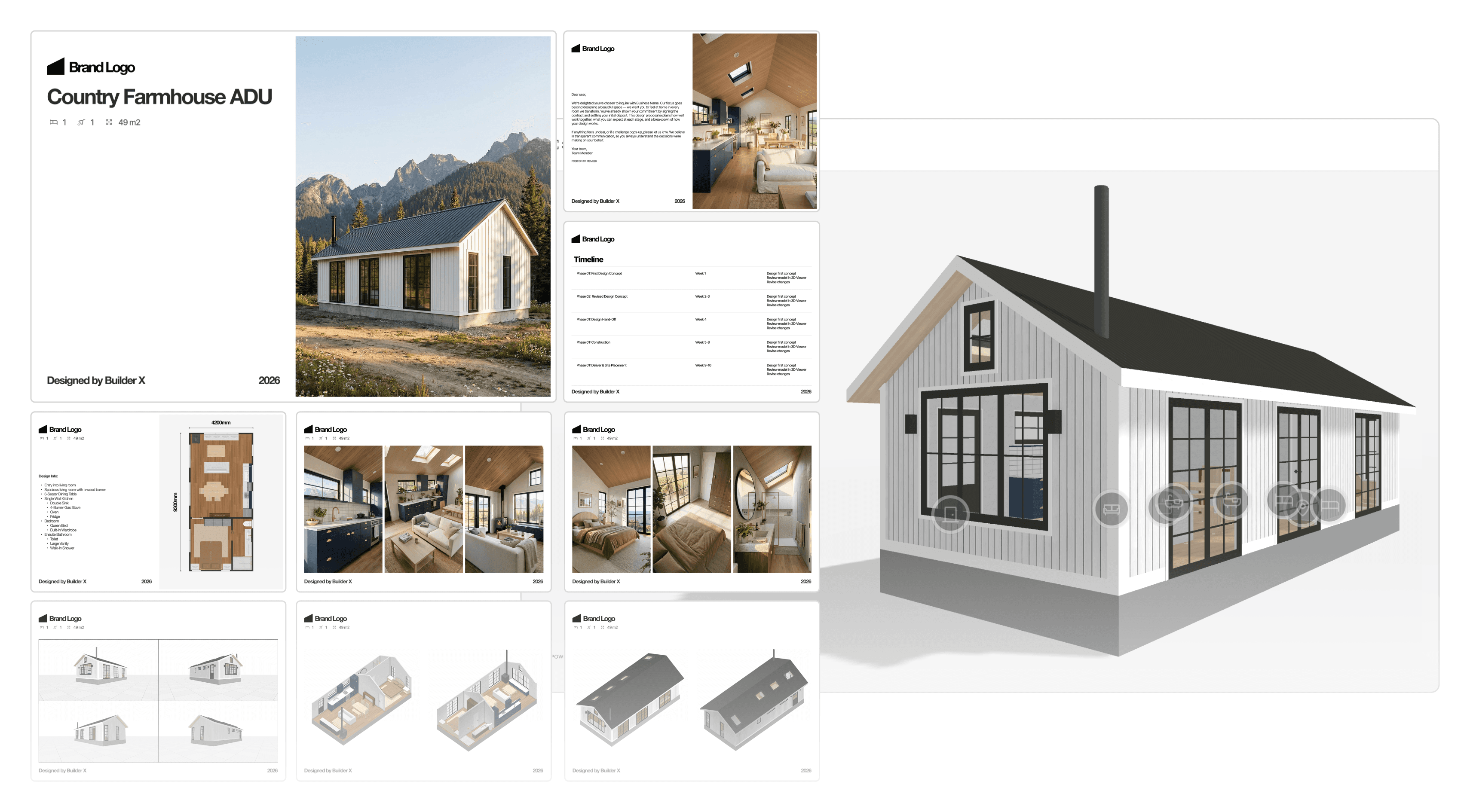
It helps builders bring together the key parts of a project, including 3D Viewers, PDF plans, AI Renders, specifications, pricing, inclusions, available options, and next steps, into one clear presentation.
Instead of starting from a blank document every time, builders can begin with suggested proposal templates designed around the way small home projects are actually sold. These templates provide a practical page structure for presenting a customised design, with sections for introducing the project, showcasing the design, explaining the layout, outlining specifications, presenting pricing, and guiding the client toward the next step.
This gives builders a faster way to insert the right content in the right order without needing to design a full proposal from scratch. Pages can be adjusted, removed, duplicated, or added as needed, so the proposal can still be tailored to the client without becoming a complicated custom design task.
The value is not just that the proposal looks better. It helps the client understand the project faster. Instead of receiving disconnected files, flat plans, separate renders, and a pricing document, they get one polished proposal that brings the design story together. They can see the home, understand the layout, review the key details, and know exactly what happens next.
For builders, this creates a more repeatable and professional sales workflow. It reduces the time spent assembling proposals manually, keeps presentations more consistent across the team, and helps move clients toward sign-off, approval, or deposit with greater confidence.
Handoff
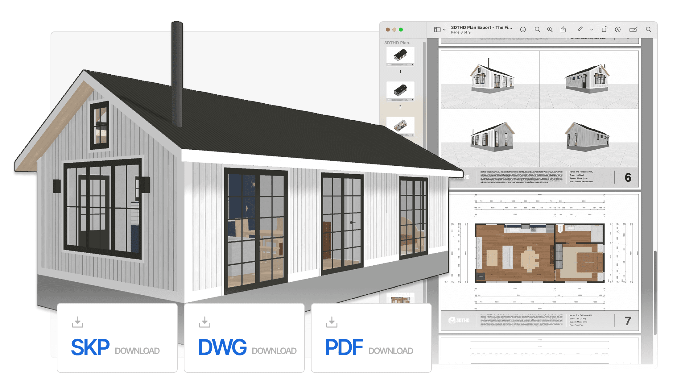
When the design is approved and it's time to move into documentation, the 3D Designer exports everything needed to take the project forward. PDF plans are generated directly from the model — accurate, professional documents that give a draftsperson or architect a clear picture of the design intent without any redrawing required.
Alongside the plans, an auto-populated material take-off spreadsheet exports directly from the design. Rather than manually costing a new model from scratch, the material list is already populated and ready to work from — saving hours in the estimation process and reducing the margin for error when putting a quote together.
For those who need to take the model further, the 3D Designer also exports a SketchUp file, allowing the design to be carried into more advanced workflows without having to rebuild from scratch.
For builders, this closes the loop on the entire process — from first sketch to professional handoff — without the design ever leaving the platform. It's a faster, cleaner way to work that reduces errors, saves cost, and keeps the project moving.
Ready to Design your Own?
This cabin design is proof that a small footprint doesn't mean compromising on quality — in the design, the experience, or the process behind it.
What made it possible wasn't a team of designers or an expensive production pipeline. It was a single platform, built specifically for the way small home builders actually work.
If you're a builder who wants to walk into your next client meeting with renders like these, proposals that are ready to go, and a process that runs end to end without the usual friction — book a call with us and let's talk about what you're building.


100+ Businesses use Tiny Easy in their Sales, Design & Proposal Workflow